
7 Steps to Unique Badge Design
Creating unique badge designs for stickers and other product, will help you stand out as a brand.
In this blog post, I share 7 steps you can use to design unique badges for use on a multitude of applications.
I recommend working through each TASK below so you can get a sense for the process.
Step 1 - Choose a theme
If you look at your favourite badge designer, all of their badge designs have a theme and style. Whether it’s an overall theme or a theme for a specific release.
Themes are based on a subject-matter or topic. Having a theme will give you direction for your designs and make your collection look consistent.
Style is a little more difficult to work through since that is developed over time and is different for each designer and illustrator. (That’s a whole other blog post!)
Once you have your theme, collect as many keywords and references related to that theme as possible. Hit up your local museum, art gallery, cafe, antique shop, or anything related to the topic. Immerse yourself in an experience to find some inspiration. THEN check out what the world-wide-web has to offer.
In starting offline first, you’ll get real world references and first hand experiences vs. seeing the theme through the lens of another creator.
When you’re feeling good about what you’ve collected, you can start developing concepts!
TASK: Pick 3 themes that inspire you and write as many keywords relating to that theme as possible. Conduct research both online and offline.
Example: Maybe you love vintage signage and dinosaurs. Maybe your favorite style is something out of the 50s or something more techy. Mix all of that together and you’ll get something pretty unique. You’ll also find an audience that loves it too!
Step 2 - Concept development
I find concept development to be the most challenging part of the process as we’re creating a badge that doesn’t exist yet (hopefully!) AND require to have that badge visually telling a story without any verbal explanation.
The best way to develop concepts that are unique is to ask yourself some questions:
What you want to design and why?
What message are you trying to communicate?
What is the purpose of your design?
How do you want it to be perceived?
Sometimes it’s straight forward. Other times, it’s not. It really depends on what you’re trying to achieve with the design.
Most of the time, concepts need to be worked out through sketching, researching how that idea is currently communicated, and thinking about what you can do that’s different.
Sometimes though, concepts can strike at the strangest times like in the shower, out of a dream, or while you’re making dinner so keep that notebook handy!
TASK: How can you tell the story you’re trying to tell in a simple, visually appealing way? What’s currently being done and how can you do it differently? Write or sketch some ideas keeping your theme in mind.
Step 3 - Think about color & font
Before digitizing, consider the color palette & font ahead of time so you’re not distracted by those things WHILE you’re composing and digitizing the design. Working out too many visual problems in one session can have things looking messy or not thought through.
Will your colors be bright and energetic? Or muted and soft? Maybe they reference an era of time?
Color & font will help further communicate the essence of a badge design, the feeling, or the message behind it.
I typically do online research for this but the library is always a lovely resource for historical reference or photo books. And the type of research you conduct, will all depend on your theme.
I limit my colour palette to 3-5 colours and my font selection to 1 or 2. Too many takes away from the design and adds too much complexity. Not enough, and the design doesn’t look finished. However, there are always exceptions to these rules and will depend on your style or goal you’re aiming for in your badge design.
Limit or eliminate special effects (like gradients, drop shadows, etc.) as they won’t print well (if at all) in certain applications.
TASK: Choose 3-5 colours that suit your design. Again, consider theme, style, and emotions you’re trying to capture. Is the design upbeat? Funky? Muted?
TASK: Choose a font that suits your design. Consider theme, style, and emotions you’re trying to capture. Is the design traditional? Modern? Elegant?
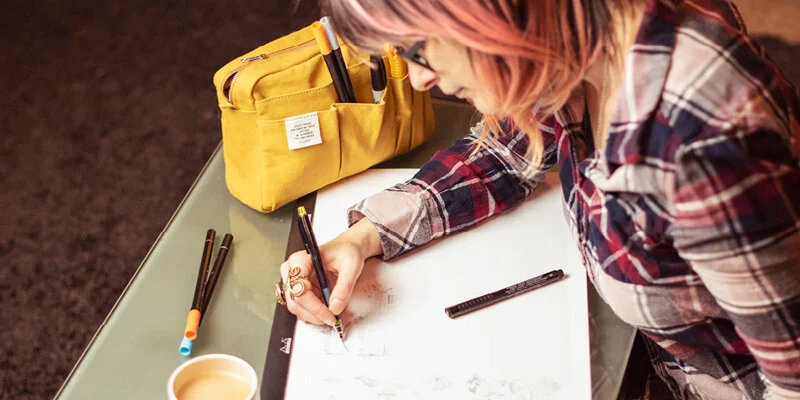
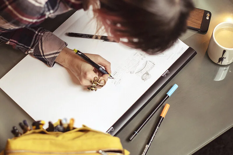
Step 4 - Start sketching your badge
Me sketching new badge designs
Sketching is an important part of the process and is also unique for each designer & illustrator.
Some sketch out every detail until they get it right. Others quickly get a feel for the design on paper before finalizing it on the computer. The rest, skip sketching all together and go direct to digitizing.
My process falls somewhere in the middle - and can fluctuate based on how confident I am in an idea.
Most times my ideas are in the form of a napkin sketch or doodle, so that I can work out placement of elements really quickly. If I’m a little unsure of what I want to design or how I want it to look, I’ll take some time to get into details on paper. The very rare time I go straight to digitizing, I have elements already created and can use them to create something new.
“If you’re new to design & illustration, I would recommend always sketching an idea first.
Learning to think with a pencil will be invaluable to helping you understand how to solve a problem visually, work out ideas without the distractions of colours, fonts, effects, etc., and prepare you to share your ideas with clients before spending too much time on something that might get canned. ”
Sketching is so much quicker in the beginning too! Jumping into digitizing right away, can leave you in a state of digital wandering and can chew up valuable time.
You’ll notice that the more you sketch a single idea, the better the idea and the drawing becomes which will save you tons of time in execution.

One of my doodle pages when I was lacking inspiration. My theme was garden and it took me down the rabbit hole of mushrooms.
If your drawing skills are subpar, don’t worry. Being the best sketch artist in the world isn’t necessary. Just as long as you’re putting pen to paper, that’s the most important. With time and experience, you’ll not only get better at this part of the process but you can start crafting and refining it to suit your needs.
“TIP: Fresh out of ideas & inspiration? Take a piece of paper or grab your sketchbook and doodle everything related to a single subject. ”
TASK: Get a big piece of paper. Take your theme, subject, and style selections, and sketch out as many ideas as you can until the page is full. What was the result?
Step 5 - Digitize
Digitizing a design is done in a digital program like Illustrator. Since this program is a vector-based program it allows for sizing the artwork to as big or as a small as one wants without the loss of quality – unlike designing in a program like Photoshop (which is pixel/raster-based) and better suited for photographs.
Imagine you design something and a company asks for a larger version of your sticker design for a wall or side panel of a car. With a vector-based program, you can size it quickly and be done in a matter of minutes. With a raster-based program, you risk having to recreate it to fit the larger size, which could take hours.
You can read more information about vector vs. raster graphics here. A very important concept to understand in the design & illustration world.
I typically design my badge on a 4”x 4” artboard in Illustrator so the artwork and file size doesn’t get overly large or doesn’t get too small to work with.
Additionally, I build out the badge in black and white so I can get a feel for how it’s looks as a graphic element before I start to add colour.
TASK: Design your sticker design in a single colour. Does the composition look clean & balanced? Are you happy with the placement of elements? Adjust until it looks as complete as it can be.
Step 6 - Peer Review
This step is a simple one which may offer valuable insight into how your badge design is being perceived?
I often share designs that are as final as can be with creative peers or my partner so that I can get a fresh, first impression of what I’ve created to find any flaws or holes in the design or concept.
This requires me to remove all emotion from all the work I’ve put in so that I can ensure, I have an open mind to hear how the design is perceived.
If it’s not working, I fix it. Sometimes, I even scrap the design all together.
Most times, it only requires a few tweaks before I send it off to print.
Step 7 - Printing
Once the badge is finished, you can send the final AI or PDF file to the manufacturer for production.
Keep in mind that some applications like patches, pins, and even t-shirts, can be restricted in the amount of detail that’s possible depending on the execution and manufacturer. Your manufacturer should be able to make recommendations on design changes that need to be made for highest quality output.
Once finalized, they should send you a digital proof to ensure everything will trim properly and the colour and size is what you want. Once approved, it is printed and shipped.
Some people choose to print on their own, which is an art in itself, so it’s up to you to decide what works best.
TASK: Choose whether you’ll print on your own or pick a sticker manufacturer to help you get them printed.

By using the link above to place your first order, I will receive a small discount on my next sticker order.
Was this post helpful? Comment below to share your sticker design results.
Or, read by category
Art & Design | Small Business | Inspiration | Product | Spotlight